ATI4 Advice
Reducing friction in the B2B e-commerce journey.
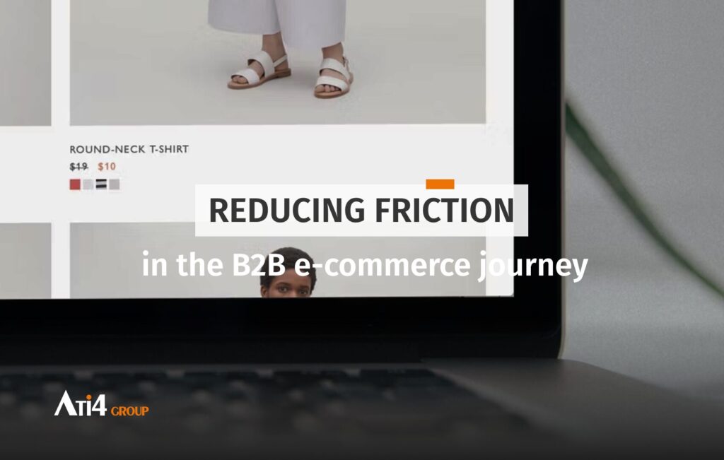
In B2B e-commerce, adding to cart is a strong signal. Unlike what we often observe in B2C, where purchases can be impulsive and immediate, the B2B journey is more thoughtful, longer, often interrupted, but rarely insignificant. When a user adds a product to their cart, they demonstrate genuine interest in the brand and/or its product. And when they don’t complete the order, it doesn’t necessarily mean a loss. Rather, it should be seen as a moment to rework, an opportunity to bounce back from.
Cart abandonment rates vary between 55% to 80% depending on the sector. This figure alone justifies taking it seriously, especially since simple and effective solutions exist. The issue today goes beyond cart abandonment alone: conversion challenges affect the entire user journey, from prospecting to delivery.
Indeed, consumer behavior has radically changed: buyers are more autonomous, connected and active, and the linear conversion funnel has given way to more complex behavior, the “messy middle” (a fuzzy zone between exploration and evaluation, where the consumer navigates without apparent logic between pages, products, brands, etc.). The same product can be viewed at 8am on a mobile app and at 9pm on a computer, with very different expectations and behaviors.
An abandoned cart is therefore not necessarily an end in itself, but can be the beginning of a purchase intention. It then becomes fundamental to understand what lies behind this abandonment: hesitation? A lack of information? Technical friction? An unpredictable external context?
Studying your customer profiles
The first reflex should no longer be to accumulate data. The real challenge today is to cross-reference, score and segment the data already in brands’ possession. But this analysis must be :
- Dynamic, to avoid rigid or manual approaches,
- Automated, to gain efficiency,
- Test-based, because marketing hypotheses must be validated by real behaviors.
A sociodemographic profile, however precise, is no longer enough. It’s the behavior on a site (pages consulted, products viewed, actions performed) that will reveal the customer profile. And the data collected that you’ll need to leverage is numerous :
- Behavioral data: clicks in emails, page views, visit duration, interaction with certain key pages like pricing or product comparison,
- Transactional data: purchase history, frequency, average order value,
- Engagement data: adding to cart, wishlist registration, product sheet downloads, variant choices…
These micro-conversions are all weak signals but precious ones, revealing purchase intent, even if the final conversion hasn’t happened (yet).
Segmentation must go beyond traditional “abandoned carts” or “birthdays.” It involves building high-value behavioral segments (high carts, abandonment after a strategic page, frequent visits but no conversions, etc.). Each segment can (and should) be subject to adapted communication, with a relevant contextual message.
Behavioral analysis can be enriched by sociodemographic (B2C) or firmographic (B2B) data: industry sector, company size, revenue, SIRET number, etc. This allows creating similar profiles to existing customers. If a prospect has characteristics close to a good customer, there’s a strong chance they’ll convert under similar conditions. This predictive scoring logic allows further personalization of journeys and anticipation of needs.
Also keep in mind that it’s common for your customers, whether professional or individual, to use the cart as a simulation or scouting tool. Exploration is part of the journey. They add items to estimate prices, check availability, compare options. Sometimes, they go all the way to checkout just to know shipping costs, delivery times, or payment methods.
This exploration is normal usage. It shouldn’t be perceived as an anomaly. However, it must be intelligently supported. A high-performing B2B site is one that clearly displays essential information from the first steps. This notably includes shipping costs, delivery times, return policies, or specific constraints related to the sector (minimum order, fixed fees, supply delays…).
The more information is visible and transparent upfront, the more the user feels confident. The less necessary it is for them to “test” the cart to discover it. And if exploration takes place anyway, then it becomes strategic to capture their contact details as soon as possible to be able to follow up appropriately.
When the experience blocks, real frictions need to be identified
Beyond exploration, some purchase intentions simply fail because of friction points. These barriers are sometimes technical (slow site, mobile bug, payment failure), sometimes functional (too many steps, unnecessary requests, lack of auto-completion), and sometimes related to the site’s overall experience.
70% of carts are abandoned… but it’s not always purchase abandonment. According to data from the Baymard Institute, nearly 70% of carts don’t convert. But behind this figure hide 3 types of abandonment, each with its causes and follow-up opportunities.
There are 3 types of cart abandonment :
- Exploratory abandonment (representing about 50% of abandonments): A case where the user had no immediate purchase intention: they compare, simulate, test a promo code, check shipping costs, use the cart as a wishlist. They may return later, if they’ve been well nurtured upstream (inbound marketing). It’s difficult to catch them short-term, but the seed is planted.
- Friction abandonment: The customer intended to buy, but a technical or functional problem stopped them (bug, fees, tunnel too long, UX). This one can be effectively followed up, but requires correction of irritants.
- Contextual abandonment caused by an external or emotional factor (distraction, urgency, doubt…). This type of profile can return later, if you stay in their memory, via well-dosed follow-up or retargeting.
Most of these problems could be avoided if UX fundamentals were properly applied. And yet, too many B2B sites still neglect crucial points. Interface clarity is often underestimated: poor readability typography, information overload, weak contrasts, inconsistent structure from page to page. Readability is a reassurance lever, just like graphic consistency between desktop and mobile. A user who switches from one screen to another without finding their bearings is already losing confidence.
Added to this is a performance challenge. Loading time of more than 3 seconds on mobile drastically increases abandonment rate. It’s not just a technical detail: it’s a commercial barrier. It’s therefore essential to work on Core Web Vitals (with Hyvä, for example) and ensure the site is technically smooth, fast, stable. This work may seem invisible short-term, but it plays a determining role in the perceived quality of experience, and therefore in conversion.
Moreover, one of the most critical moments in the journey is undoubtedly the checkout funnel. It concentrates all emotions alone: hope of completion, fear of making a mistake, need to go fast. It’s also often where abandonments crystallize.
This is where the notion of neuromarketing comes in with 3 major cognitive biases that can hinder conversion.
- The distrust bias which appears when the user doesn’t understand or doubts what they see (vague fee mentions, inconsistent promises, design not aligned with brand positioning).
- The cognitive overload bias, also called intentionality bias, which occurs when we ask too much mental effort from the user (too much information, instructions, too complicated a journey). Know that a human has difficulty retaining more than 3 key pieces of information at once.
- The perceived effort bias, which is the feeling of a journey that’s too long, too complex or poorly adapted (too many clicks, forms too long, frustration, confusion or waiting). If your user has to make more than 3 clicks to access information, you risk losing them. And this trend is amplifying with digital evolution: users are increasingly demanding and impatient.
A good checkout funnel, especially in B2B, is an efficient, clear, fast funnel. It only asks for essentials, offers intelligent auto-fill options, allows ordering in guest mode, doesn’t unnecessarily block the user with account creation constraints. At this stage, every unnecessary click is a barrier.
But don’t think a good funnel is only about ergonomics. It also plays a reassurance role. A clear order summary, transparent fee display, ability to go back without losing everything, highlighting security labels or explicit return conditions… all this contributes to creating a sense of control. And it’s this feeling that allows the user to validate their order without hesitation.
But also keep in mind that not all abandonments are site-related. Some are simply due to external factors. A call, a meeting, an interruption. In B2B, these unforeseen events are daily. This type of abandonment is temporary, but it must be followed up.
Following up a user in this context isn’t about doing automated marketing at all costs. It’s first about being useful. This can involve a discreet cart reminder, resuming where they left off, offering human assistance, or even a simple message like: “Would you like to resume your order?” Timing is essential here. Too quick follow-up can seem oppressive. Too late follow-up loses all effectiveness.
Working on UX fundamentals: the foundation of any anti-friction strategy
Reducing friction is above all foundational UX work. And this relies on five major pillars that must be integrated as priorities.
- First: clarity A site with readable visual hierarchy highlights key elements: price, call-to-action, delivery times, delivery conditions. Information overload or graphic confusion creates unnecessary tension.
- Second: consistency A design that adapts perfectly to different devices, maintains the same visual landmarks from page to page, ensures smooth navigation… This is the foundation for users not to get lost.
- Third: technical performance Loading times, mobile display, on-screen element stability, all this affects overall perception. And it’s not just UX: it’s also SEO.
- Fourth: the conversion funnel The simpler it is, the more effective it is. This assumes few steps, optimized fields, pre-filling and above all, the ability to order without an account.
- Fifth: transparency A B2B customer wants to know where they’re going. This involves highlighting customer reviews, return policies, real fees, seller identity. You can’t expect to sell to professionals if you don’t give them reliability guarantees.
No friction work will be useful without minimal analysis. Setting up a tracking system won’t serve to measure everything roughly, but will allow you to understand the micro-signals that precede abandonment. What are the repeated behaviors? What are the exit points? What’s the typical path of users who convert vs those who leave?
It’s only by cross-referencing this information with a clean CRM base, follow-up campaigns and detailed knowledge of customer typologies, that you can really improve conversion rates. Cart abandonment should never be seen as failure. It’s often the expression of an unsatisfied need, hesitation, or poor timing. What you do with it, as a B2B e-merchant, directly determines your long-term performance.
You have an e-commerce project ?
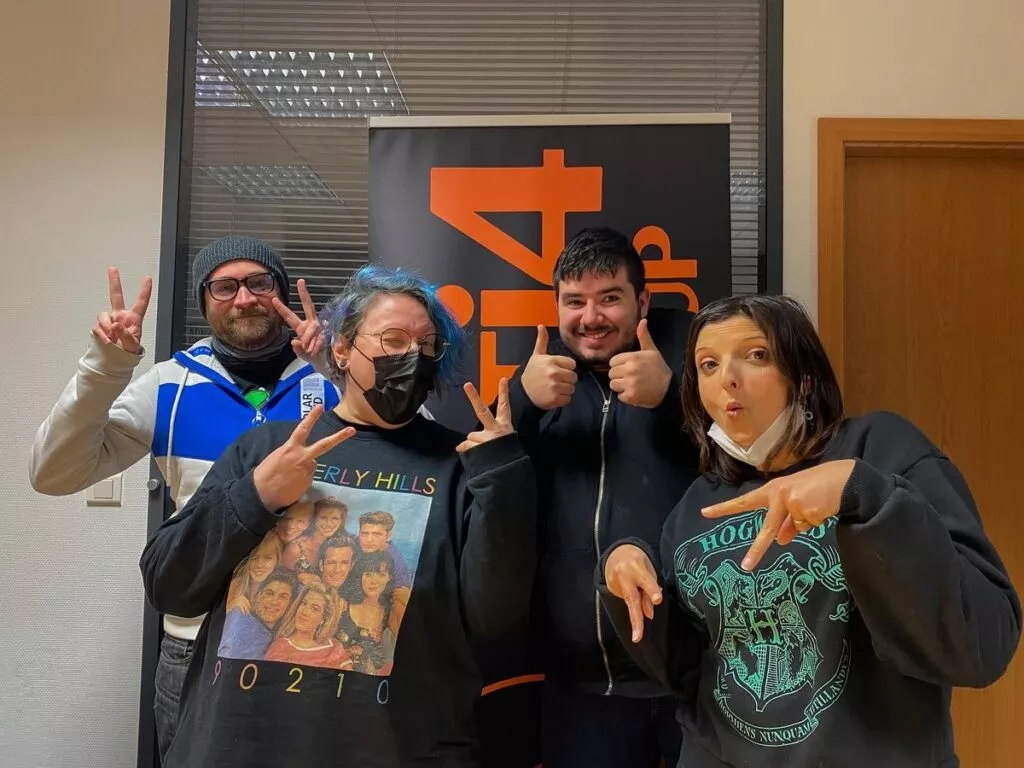
Find out what’s new at the company.
Because mixing fun and work is at the heart of our philosophy, we always try to make a special place for it in our business life.
2026: Investing in a tight economic context
13 March 2026
The current economic context reminds us of a simple truth that is sometimes forgotten in the excitement of digital: every euro spent must have a measurable impact. Should you continue investing to avoid falling behind, or slow down to preserve cash flow? The right answer is probably somewhere in between.
AI is reshaping e-commerce: What if it were your greatest opportunity ?
6 March 2026
AI is reshaping e-commerce. Threat or opportunity? Learn how to leverage artificial intelligence to strengthen your brand, customer relationships, and long-term performance.
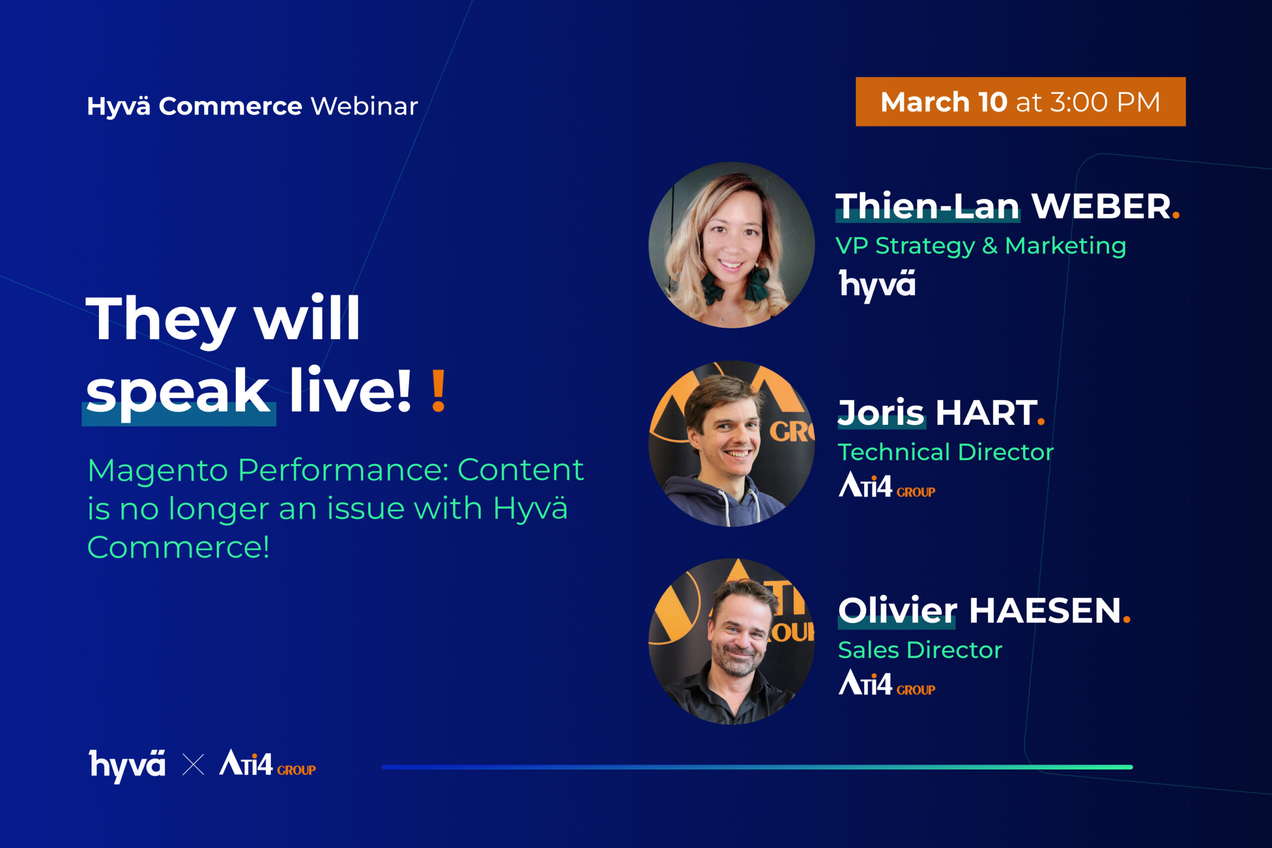
Hyvä Commerce: the Magento e-commerce revolution you’ve been waiting for
27 February 2026
For years, Magento has been built through successive additions. And today, the platform is fragmented, the frontend remains heavy, content management is complex, and the admin is aging. Hyvä Commerce changes this equation. This is not a passing trend; it is a reinvention of what a modern e-commerce store should be.
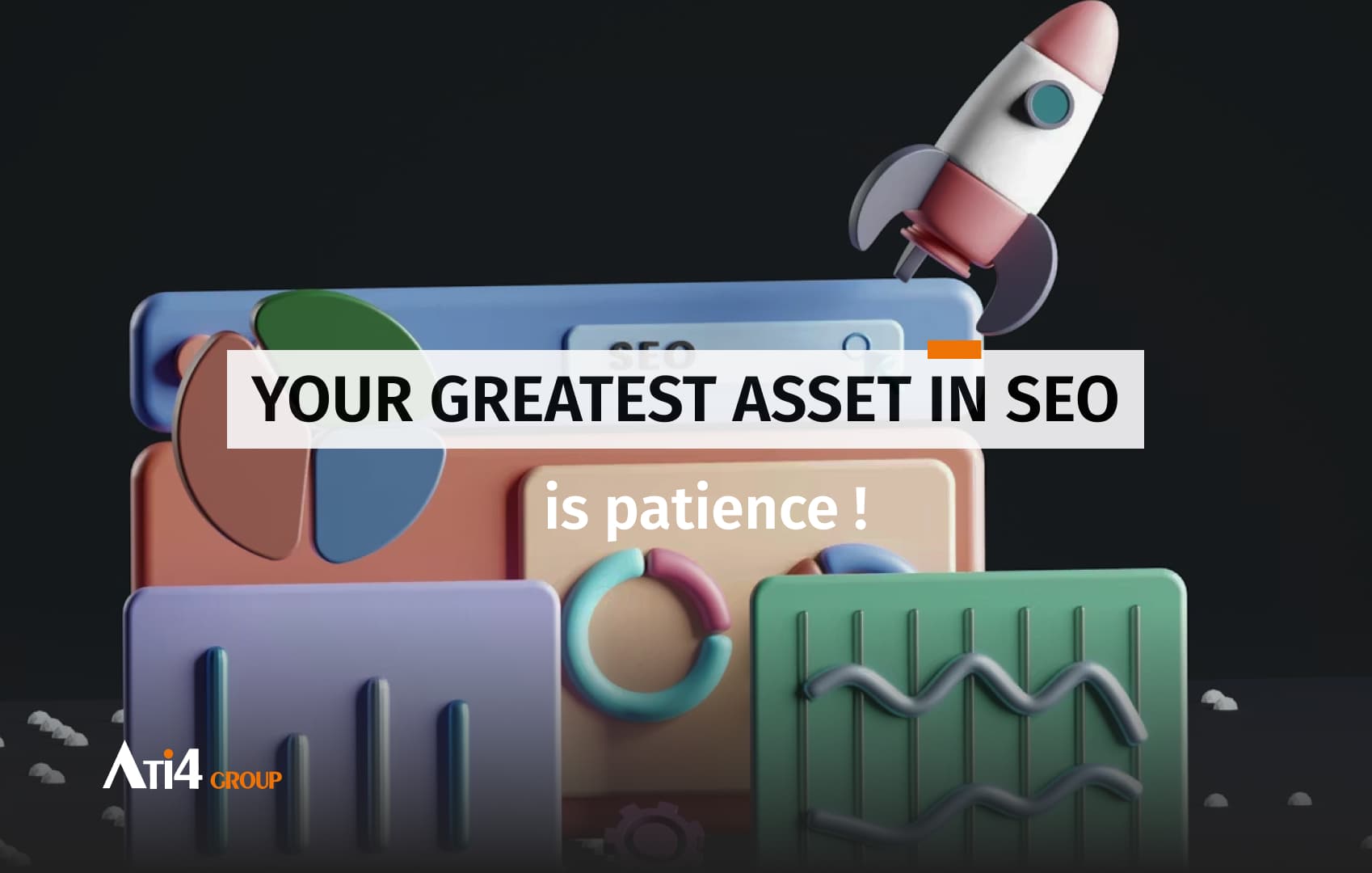
Patience is your greatest asset in SEO
20 February 2026
Discover why organic search requires several months before delivering results. Understand how SEO works and the realistic timelines you should anticipate for your e-commerce business.
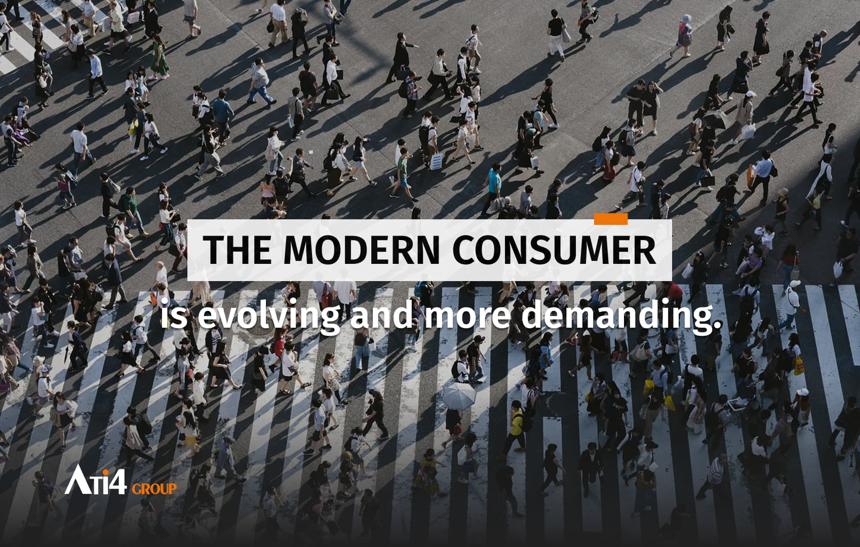
The modern consumer is evolving and becoming more demanding
20 February 2026
The modern consumer is becoming more demanding and brands must rethink product information, customer experience, and personalization to succeed in 2026.
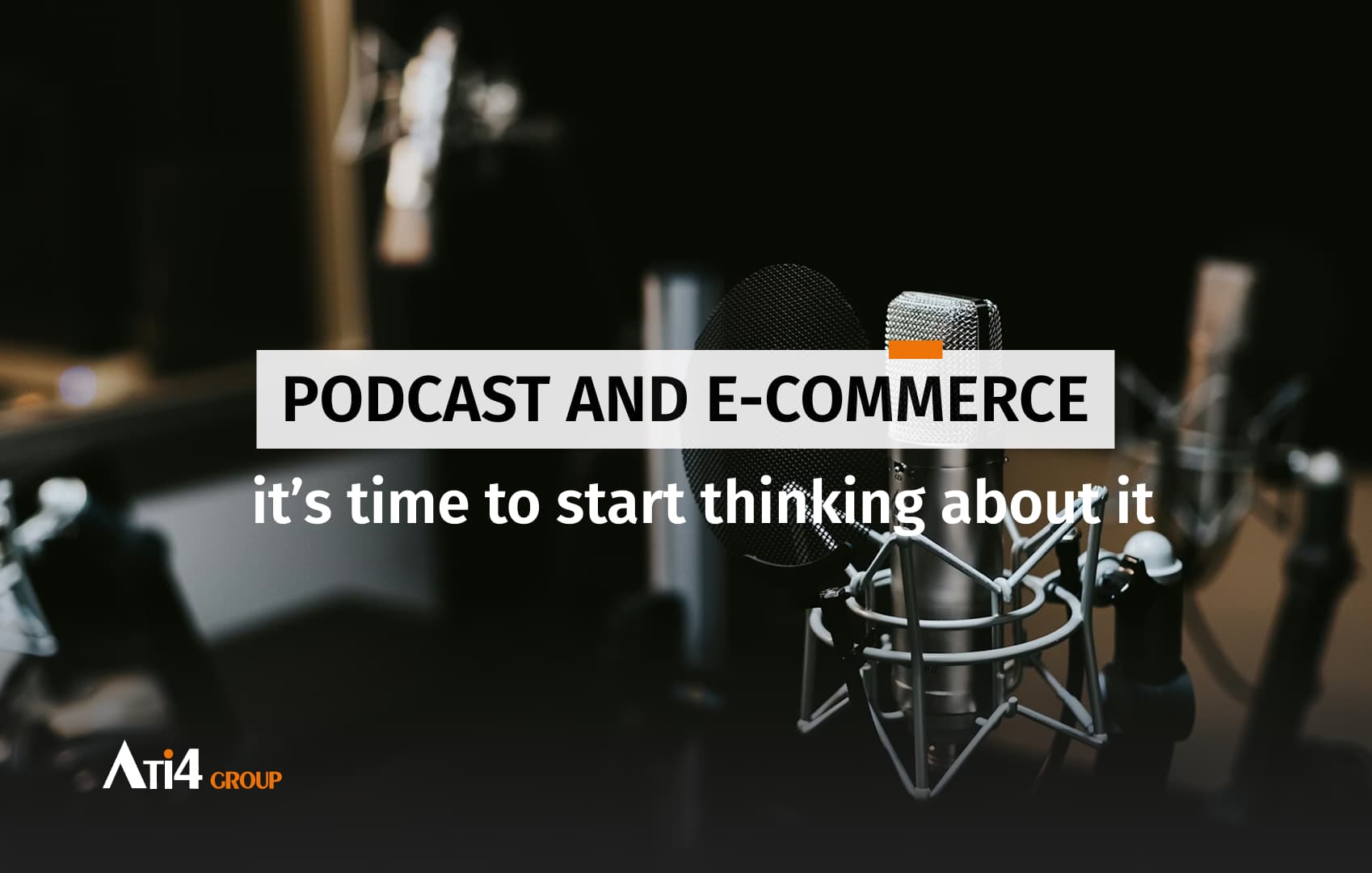
Using podcasts in your e-commerce strategy: Now is the time to start thinking about it
13 February 2026
Discover why podcasts are the most underrated tool in digital marketing: authentic connections, content leverage, partnerships, and internal culture building.
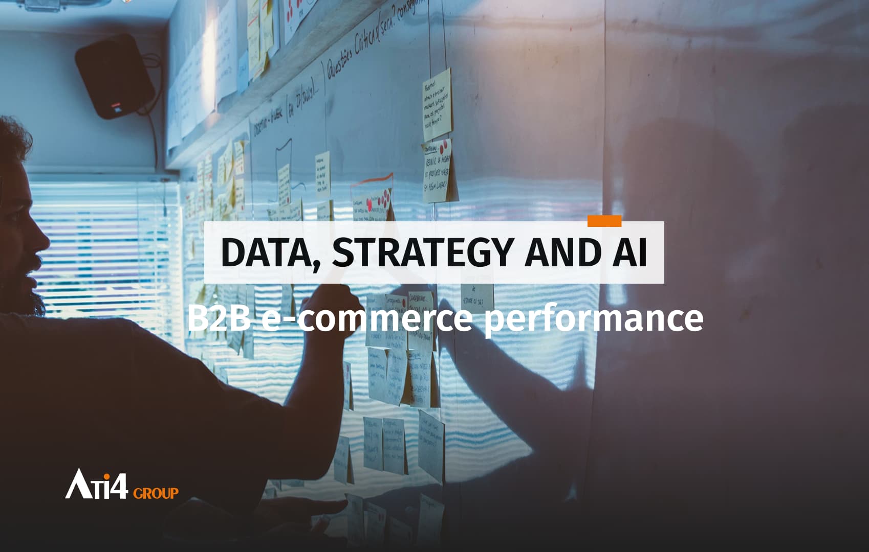
Data, Strategy and AI, the golden triangle of B2B e-commerce performance.
6 February 2026
Discover why the data-strategy-AI triangle is now the engine of B2B e-commerce performance, and how to apply it concretely to build sustainable competitive advantage.

Gold Upsun Partnership: Everything you need to know
6 February 2026
At the end of January 2025, we officially earned our Gold badge as an Upsun partner! A great recognition of our technical expertise and our commitment to supporting you in transforming your hosting infrastructures. Let us explain what this means concretely for your projects.
Should you use a PIM as a way to optimize your SEO?
31 January 2026
Discover how a PIM (Product Information Management) can boost your SEO by centralizing product information, automating multi-channel distribution, and enhancing organic visibility.

Your Magento e-commerce needs a high-performance CMP in 2026
30 January 2026
Why a high-performance CMP is a strategic investment for Magento B2B e-commerce, ensuring GDPR compliance, data quality, and marketing performance.

The CURL framework for building your brand authority in the age of artificial intelligence
23 January 2026
Learn how the CURL framework strengthens the credibility, utility, reputation, and loyalty of your B2B brand in the age of artificial intelligence. A strategic roadmap to becoming the trusted reference AI systems naturally recommend.

The role of AI in creating a personalized shopping experience
9 January 2026
Discover how artificial intelligence is revolutionizing e-commerce, from hyper-personalized shopping experiences and 24/7 virtual assistants to predictive inventory management and fraud detection. Learn how AI reshapes customer interactions and optimizes operations for a tailored, efficient, and engaging shopping journey.
Optimizing delivery and payment: The keys to a high-performing checkout funnel
2 January 2026
Optimize your checkout funnel with better delivery and payment experiences. Learn how to reduce cart abandonment, increase conversions, and create a seamless and efficient customer journey.

E-commerce and omnichannel strategy: the future of retail
26 December 2025

Digital accessibility : challenges and solutions for e-commerce
19 December 2025
E-commerce accessibility isn’t optional—it’s the law. Avoid €20K fines and tap into a $13T market by fixing these 5 critical issues (hint: your carrousel is likely one).
E-commerce 2026: between maturity, innovation, and the new data era
8 December 2025
In 2026, e-commerce is entering a phase of profound transformation. After two decades of almost uninterrupted growth, the European market—especially in France—has reached a stage of maturity where performance is no longer driven solely by traffic acquisition or conversion rate optimization.

Growth Hacking and SEO : how to boost your online visibility
5 December 2025
Learn how to combine growth hacking and SEO to boost visibility, increase qualified traffic, and turn your website into a true growth engine.
GEO: Understanding generative engine optimization
28 November 2025

The different types of website redesign: how to choose the right modernization strategy
22 November 2025
Websites have a limited lifespan (often 3 to 5 years) before they require a refresh. Technology evolves, user behavior changes, and expectations regarding design and digital experience continue to grow. However, “redesign” does not always mean the same thing.

Which digital channels should you use to generate leads in B2B and B2C ?
15 November 2025

Hyvä Theme goes open source!
10 November 2025

Optimizing web performance: from theory to practice
8 November 2025
In today’s context, every millisecond gained on your site matters. Optimizing your web performance is a real advantage for customer experience.

Defining your editorial line for web content
3 November 2025

Matomo 5.5.0: What this update changes for your web analytics.
27 October 2025
Matomo 5.5.0 marks a turning point for web analytics. This version introduces features that allow you to better understand traffic from emerging digital sources, particularly AI assistants such as ChatGPT, Copilot, Gemini, or Claude.
Writing your SEO content with the inverted pyramid method
27 October 2025
Web writing increasingly borrows techniques from journalism, and one of the most effective for capturing attention is the inverted pyramid.
We flew to Mallorca for our 5th anniversary
23 October 2025
How to Celebrate Our 5th Anniversary? Here’s a recap of our trip to Spain, in Palma de Mallorca.

How to stand out and boost your online visibility ?
20 October 2025
Personal branding has become a key lever in building your marketing strategy. Indeed, it’s no longer just about selling your product or service — it’s about selling a story, a vision, and a personality around your brand.

E-commerce copywriting: the methods that convert
11 October 2025
In B2B and B2C e-commerce, the effectiveness of product pages relies on the notion of copywriting, which is the art of writing texts that inform, engage, and drive action.
Shopper trends 2025
4 October 2025
For four years, the Shopper Trends barometer has reflected the evolution of purchasing behaviors and consumer expectations. And in 2025, the French are reinventing their shopping journeys.
B2B product sheet: the forgotten recipe
20 September 2025
In the B2B context, new skills are essential. And at the heart of this strategy, one element plays a key role: the product sheet.
B2B SEO myths: Debunking common misconceptions
13 September 2025
In the current economic context, it’s difficult to convince that brand awareness deserves its place among marketing priorities. And yet, SEO remains a major lever for B2B companies.
Succeeding in convincing the consumer in the Messy Middle
6 September 2025
We operate in a fragmented ecosystem, where consumers can juggle an infinite number of information sources, different platforms, and touchpoints before making a decision. It is a disordered, unpredictable cycle, yet one that is decisive in the final purchase decision: the Messy Middle.

The new buying journey: Google’s 4S
4 September 2025
For decades, the famous conversion funnel was enough to understand and interpret consumer behavior. But in 2025, consumer habits have radically changed, in line with new consumption trends.

5 great reasons to use video marketing
29 August 2025
Today, it’s impossible to ignore the power of video content in a marketing strategy. We break it all down in our article.

B2B e-commerce: 5 critical errors to avoid for online sales success
23 August 2025
With new buyer expectations and the transformation of usage patterns, B2B e-commerce has become a growth driver.
Akeneo & Magento: The combo for demanding e-commerce players
16 August 2025
Product information is vast, so how to manage, structure, and distribute it without friction ?
B2B: When businesses embrace the codes of consumer e-commerce
12 August 2025
When we think of e-commerce, we often picture a consumer comfortably seated on their couch, placing an order from a computer or smartphone. Yet, another reality of e-commerce deserves our full attention: B2B.

B2B customer experience
9 August 2025
Today’s professional buyers, well-informed and accustomed to seamless B2C interfaces, now expect customized purchasing journeys that are relevant, efficient, and tailored to their business needs.
Google June 2025 Core Update
31 July 2025
The Google Core Update of June 2025, officially launched on June 30, marks a new milestone in the evolution of the search engine and organic search.

Long-tail keywords: The SEO strategy that really converts
28 July 2025
If aiming for the moon seems unrealistic, there is a strategic, more precise, and above all, much more profitable long-term approach: that of long-tail keywords.
Deploying your e-commerce project internationally
11 July 2025
According to the latest industry data, more than 66% of businesses say they plan to expand internationally in the coming years.

ChatGPT & sensitive data: What companies must know
4 July 2025
Behind the smooth interface lies a system based on machine learning, which uses entered queries to refine its responses.

How to turn your social media into an e-commerce conversion engine.
1 July 2025
Far from being just communication showcases, these social platforms are now real sales channels.
Accessibility & e-commerce : Are you ready for June 28, 2025 ?
27 June 2025
Starting June 28, 2025, new digital accessibility standards will come into effect, directly impacting e-commerce websites in France. This legal obligation no longer applies only to public platforms—private companies are now included.

RGAA: Understanding the 13 Key themes of digital accessibility
19 June 2025
In France, the RGAA consists of 106 compliance criteria grouped into 13 fundamental themes that guide the audit of your platform.
Shopping & ChatGPT: A new online shopping assistant
12 June 2025
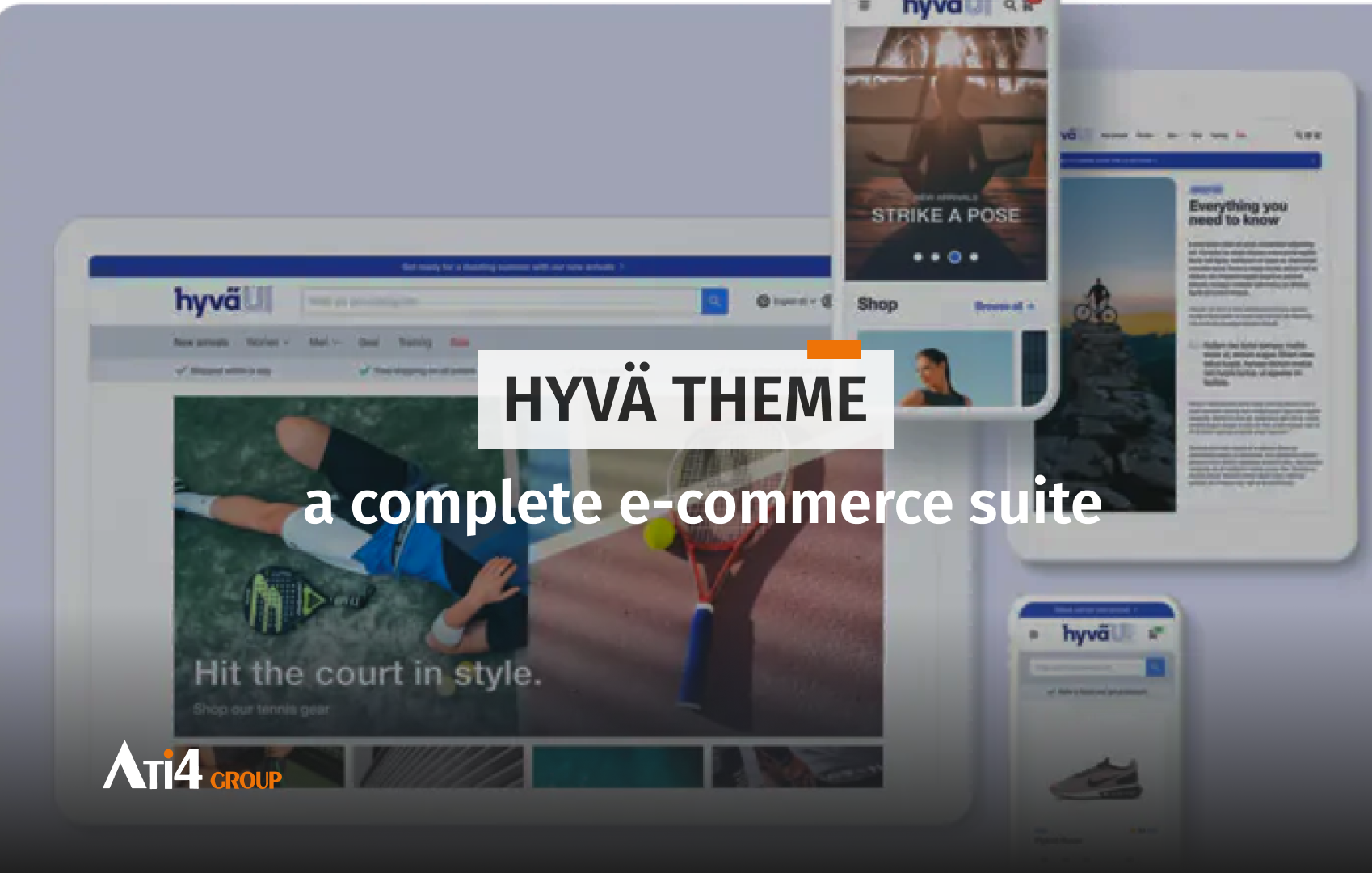
Hyvä: from frontend theme to complete E-commerce suite
9 June 2025
Over the past several months, Hyvä has been revealing a series of technical and strategic innovations that are set to transform the entire Adobe Commerce ecosystem.
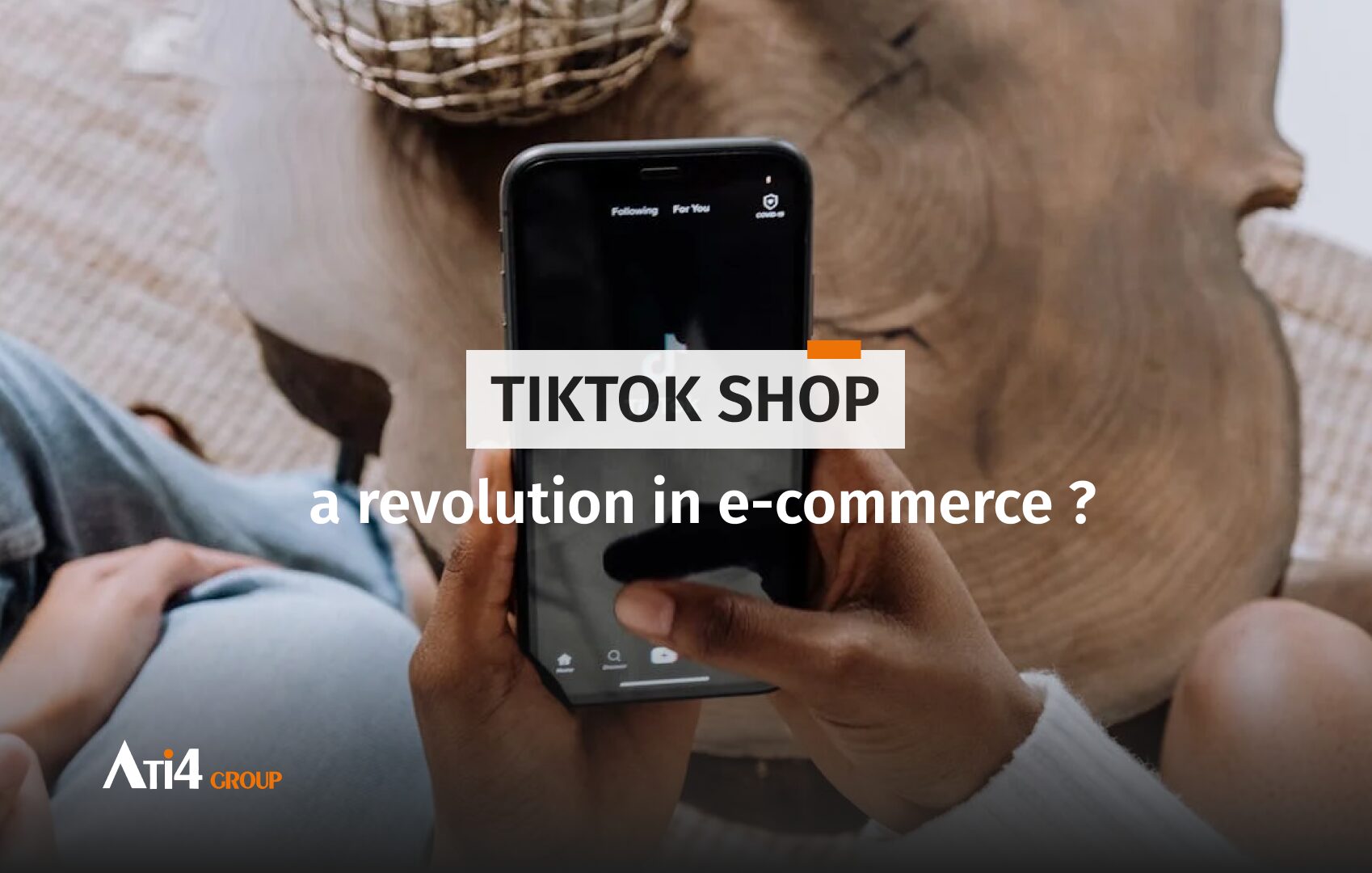
TikTok Shop: a revolution in e-commerce ?
28 May 2025
TikTok, originally known for short, entertaining videos, has recently launched TikTok Shop, a feature that could very well redefine the rules of the e-commerce game.

RGAA: New accessibility rules coming in 2025
22 April 2025
Agencies, software publishers, digital experts and all players in the digital space—you’ve likely heard the news. Starting June 28, 2025, all e-commerce services will be required to comply with new digital accessibility regulations.

Preloading and Speculation Rules API
2 April 2025
The Speculation Rules API allows browsers to pre-render pages that a user is likely to visit, providing a smoother and faster browsing experience.

AI : Opportunities and responsibilities for businesses.
14 February 2025
Through the AI Tour of France, organized by Medef and Numeum, French companies shared their experiences with AI and the concrete benefits they have gained, as part of the “AI Action Summit.”

B2B and B2C e-commerce
27 January 2025
In a world where e-commerce has become a cornerstone of the global economy, B2B and B2C sales models represent two essential facets of the system.
PIM and E-commerce: our partnership with AKENEO
19 December 2024
The PIM, or Product Information Management solution, is a tool that collects your product data and integrates it directly into the most suitable format for your team, all within a single digital platform.

Design thinking
1 December 2024
Design thinking is a methodology that emerged in the 1970s and gained momentum in the 1980s with applications across various sectors, including e-commerce.

Gen-Z and E-commerce: The digital revolution
7 November 2024
The Gen-Z consists of individuals born between 1997 and 2012 and now represents a significant sector of the digital market.

SEO keyword research
4 November 2024
Millions of internet users conduct searches every day via various search engines, whether to find answers to their questions, a restaurant, a specific item, or a schedule.
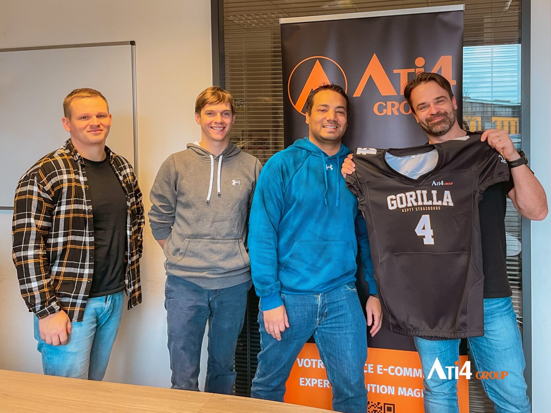
Applying the values of sports in the digital.
18 October 2024
The Gorilla Club, part of ASPTT Strasbourg, is a sports section dedicated to promoting and teaching American football in Alsace.

Cross-Selling and Up-Selling
1 October 2024
These marketing techniques encourage buyers to complete their carts with complementary products to their initial items. Although often confused, these two sales techniques have distinct objectives and can be very effective when implemented correctly.

C2C Sales
26 September 2024
C2C sales, or “customer to customer,” represent a major evolution in the e-commerce landscape. In this model, individuals are the main players, using specialized sites or applications to sell and buy goods or services among themselves.
Creating Funnels to Sell Services
11 September 2024
Sales funnels, known as “sales funnels” in English, refer to a technique aimed at maximizing conversion rates to sell more effectively online.

Online reviews: How to manage them effectively
2 September 2024
In today’s digital landscape, customer reviews—whether positive or negative—inform consumers about the quality of the products or services they are considering purchasing. Positive reviews can significantly boost sales by influencing the purchasing decisions of other consumers.

Collaborating with influencers to increase sales
12 August 2024
The new generation spends a lot of time on social media, which has led to the emergence of new professions, notably that of influencer or content creator.

Cross-border e-commerce
29 July 2024
Cross-border e-commerce has transformed the global commercial landscape. This ability to sell anywhere and anytime has significantly boosted companies’ revenues.

Using soft skills to improve your e-commerce
31 May 2024
Soft skills play an equally important role in the success and sustainability of your digital platform. They can transform the way you interact with your customers, your team, and your market.

Customer experience in retail
16 May 2024
Over the years, the focus on user experience (UX) and user interface (UI) has been constant, but today, we are increasingly moving towards another equally crucial concept: customer experience (CX).

Virtual Reality and E-commerce
6 May 2024
Virtual Reality (VR) is a rapidly growing technology that is disrupting many sectors, including e-commerce.
Optimizing product listings to boost online sales
23 April 2024
Product listings are the cornerstone of the commercial strategy. They play a crucial role in converting visitors into customers as they provide detailed information about the products offered by a company. What are the key points to watch out for and the best practices to optimize them and maximize sales?

Selecting the right CMS for your e-commerce project.
6 February 2024
The functionalities, costs, and levels of complexity can vary from one CMS to another.

Optimizing images for the web
17 January 2024
When it comes to optimizing your website’s performance, paying attention to images is a crucial yet often overlooked step.
The Hyvä Solution for Adobe Commerce
4 January 2024
The dynamics of e-commerce are evolving rapidly, with the primary goal of businesses being to provide an optimal customer experience to maximize conversion rates and, most importantly, sales. For the past two years, a new solution has been making waves: it’s the Hyvä solution and its Hyvä Reset theme.

The B2B conversion rate
30 November 2023
In the dynamic universe of online marketing and sales, the conversion rate emerges as a key indicator, reflecting the performance and success of a strategy.

marketing performance and RFM method
7 November 2023
In the world of marketing, efficiency reigns supreme.

Upcoming Trends in 2024
4 January 2024
The e-commerce industry continues to grow at a rapid pace, driven by technological innovation, changes in consumer behavior, and evolving market expectations.

Website Audit: Why is it important?
24 October 2023
In a constantly evolving digital landscape, it is crucial to ensure that your website is performing well, secure, and meeting the needs of your users.

Marketplace and e-commerce
17 October 2023
The realm of web marketing plays a central role, where the scope of digital strategy may vary, but merely existing on the web is equivalent to an active approach to online promotion.

Web marketing
29 September 2023
In today’s digital era, Web Marketing has become an indispensable element for businesses aiming to expand their online product and service offerings.

The importance of engagement rate and how to use It
18 September 2023
In the current context of e-commerce and marketing communication, the engagement rate has become a crucial indicator for measuring user interaction and involvement with content or a brand.

Sales and E-commerce: What is the Impact?
22 August 2023
The sales, that long-awaited event for consumers in search of good deals and discounts. But this event is also a major date in the calendars of e-commerce websites.

Adapting Your Branding Strategy to E-commerce
22 August 2023
Branding and e-commerce have been continuously evolving, particularly since the expansion of the internet.

Enhancing performance and user experience
22 August 2023
In a digital world where competition is fierce, the technical optimization of a website is a crucial element to ensure a smooth user experience, enhance performance, and strengthen its search engine ranking.

Securing Your Website
22 August 2023
Online commerce is in constant evolution, and the security of your website, whether you are a small business or a major brand, must be a top priority. E-commerce websites handle vast amounts of data to personalize their product and service offerings, tailoring them to the needs of their target audiences.
ATI4 blows out the third candle!
19 June 2023
We celebrated our third birthday last June 1st…. Yep, so soon! 🥳
Still on Magento 1?
15 May 2023
With Magento 2, enhancements and new features have been introduced, thus providing businesses with optimized site management.
Internal survey: the ATI4 employer brand
28 April 2023
We recently conducted an internal study to assess our ATI4 employer brand and highlight areas for improvement.
They’re certified!
6 December 2022
A year ago, we hired 4 developers to join our Magento Academy. We aimed to train them to use this new technology.

Apéro Dev, the event for developers!
2 November 2022
Last November, ATI4 joined forces with Numéric Emploi Grand-Est to host its first Apéro Dev event.
The cross-company tournament: the battle of the teams!
20 June 2022
As fans of digital technology and video games, we held our first inter-company tournament.
ATI4 celebrates its 2nd birthday!
1 June 2022
Over the past two years, we’ve had the opportunity to work with prestigious B2B clients, to learn and to develop.